Back to writings
Back to writings
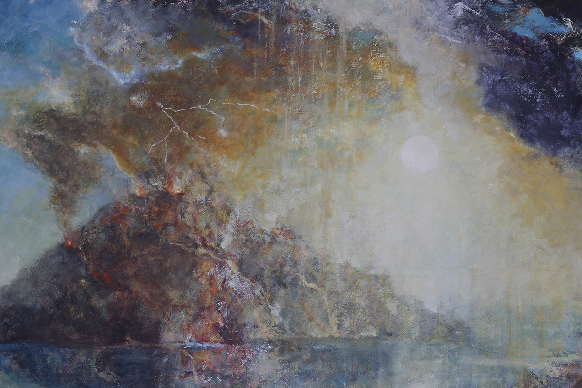
VOLCANO 001
The commission was to paint a volcano.
A long, long time ago I had been on Stromboli and made, apart from some sketches, only two paintings and never thought of it again. Now I find this strange, seeing the vulcano erupt (I went to the top of the mountain at night with full moon) made a huge impression on me.
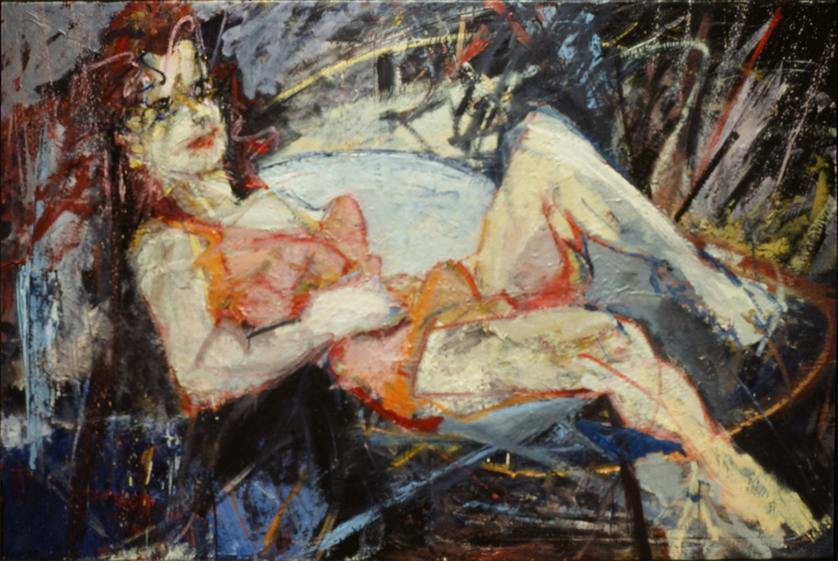
greetings from Stromboli, oil on canvas, 1987.
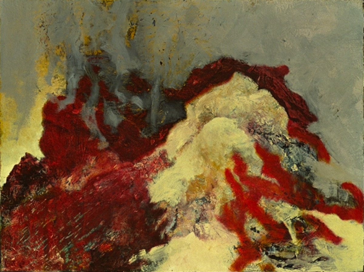
little vulcano, oil on canvas, 1987.
So when I received this commission it was a new yet familiar confrontation. As if an old volcano came to life again.
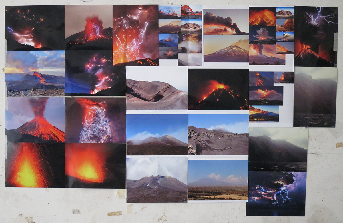
How to attack… I saw I don’t know how many videos on Youtube, had some photos from the net, some old photos of mine as well as photos from the clients printed and dug in my past.
Because of the nature of the subject I chose for my ‘old way of working’. This means painting layer over layer, scraping off, pulling underlying colors to the surface, using other means than brushes and tricks that I stole from cubism and Turner.
I saw the exhibition of Turners late works in London (2014) twice and was overwhelmed. Why did he never paint a volcano?
I wanted to stay quite near to a realistic representation, even though the request of the clients was a colorful painting.
This is a contradiction. Looking at all the videos and going back in my memories a volcano is mainly blacks and greys. Click on the photo for a video.

Sure enough there are spectacular reds and yellows, especially at night, but many colors…. No.
I had to invent a solid lie that could stand on its own, not becoming a cheap illustration, showing the essence of this incredible and violent phenomenon. Without much grey smoke and black lava.
To paint just one crater, one mountain did not appeal to me as an interesting composition. This also due to the size of the canvas: 150 x 200 cm. Three is a magical number; I made several sketches with three volcanoes erupting.
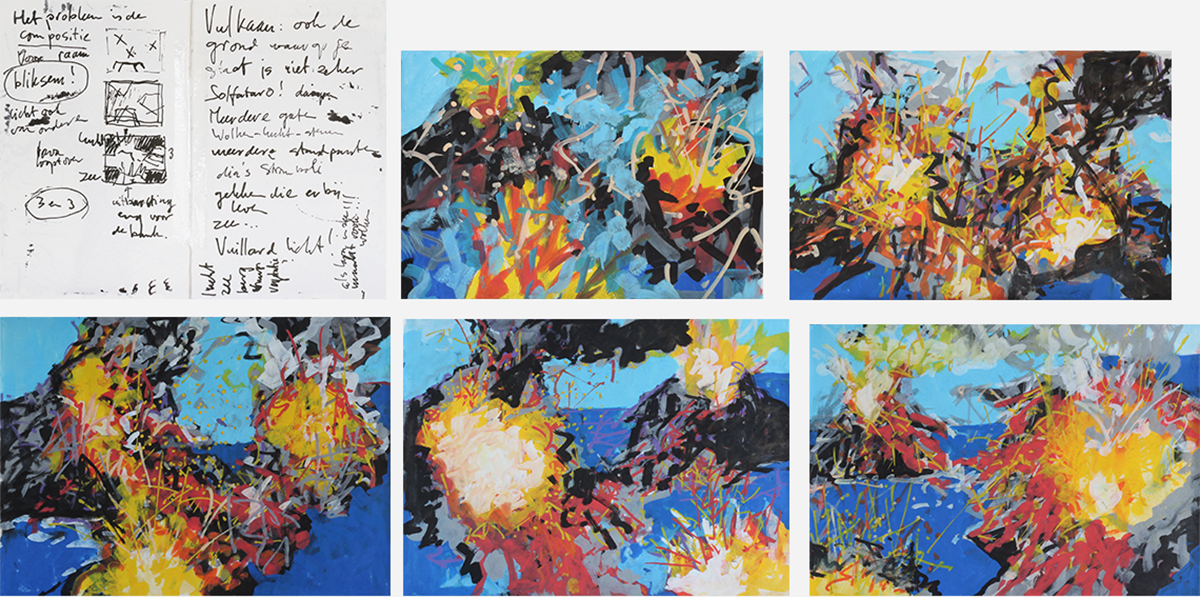
This didn’t satisfy.
In the end two were the solution, one seen from far, one seen from above.
To help see the crater from above I changed the height of the horizon on the right (already figured out in the sketches). You might see this as homage to the way Da Vinci treated the landscape in the Mona Lisa.
I placed the two volcanoes in the sea remembering the marvelous indigo blue of the sea around Stromboli and the violent color of the whitecaps.
It would give a mix of many blues, reds, yellows and oranges. Blue is an important color because it is the opposite of orange in the color circle. Here and there grey and black had to be painted.
I started with a composition already sorted out. This helps, especially because like that the underlying colors could be positioned well.
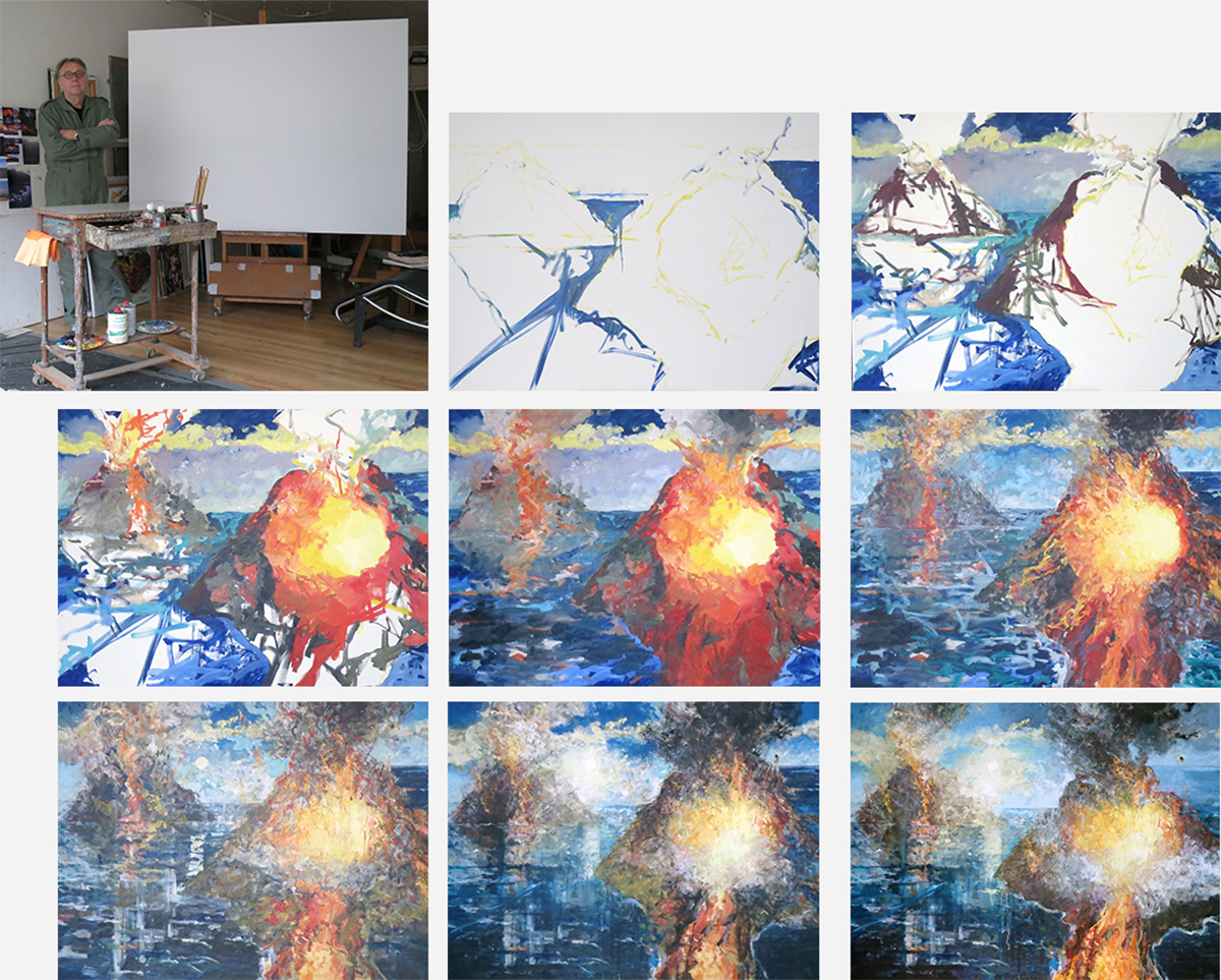
Because of the size of the painting I could keep on working on it even if some parts had to be dry before a second layer could be placed over it.
At the bottom I wanted something to happen. I let lava stream down with the idea that under the painting there is a sofa.
Clouds changed shape. I have to go towards organized chaos, let things happen before all is locked down.
And then the sun showed up, making the number three again. A diagonal line gave the sea depth.
When did that little puff of smoke enter the stage? First as part of a big cloud, but at a certain moment it remained by itself in a clear blue sky.
I remember seeing a similar puff looking at Stromboli.
These eye sours on which you keep turning back are a teasing joy in a painting. They are like a nail or door-handle your coat gets stuck behind when you try to leave a room. I discovered the importance seeing the self-portrait of Rembrandt at the Kenwood house.
The black cloud grew too big. It is nice to accentuate the overhanging menace, that's why I decided to keep it but with brighter parts and see the sky through holes in it.
I messed around with the blue and yellow and gave the sun its yellowish surrounding with next to it some purple, another opposite in the color circle.
From up above vertical lines accentuate the diagonal in the water (below right a repetition, giving direction and depth). The yellow parts make the other diagonal ending in lightning. Halfway they cross in the center of the painting behind the crater seen from above.
The sun is at the height of the right horizon.
Organization! A painting has to look obvious without imposing it upon you.
Sometimes paintings take years before I accept them as finished. This one presented itself so convincingly that I doubted for a week, made little adjustments but left it alone in the end.
To make too many adjustments can kill a painting. A certain roughness keeps it alive and gives the spectator the possibility to fill in their own interpretation.
I could have continued, killed the painting a couple of times, let resurrect like a Phoenix, but when it is there, it is there.
above:
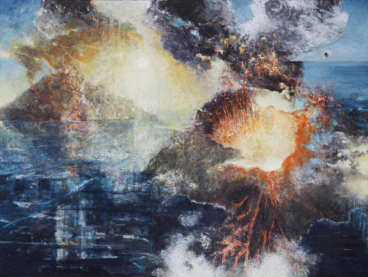
VOLCANO 001
oil on canvas
150 x 200 cm
2022
underneath:
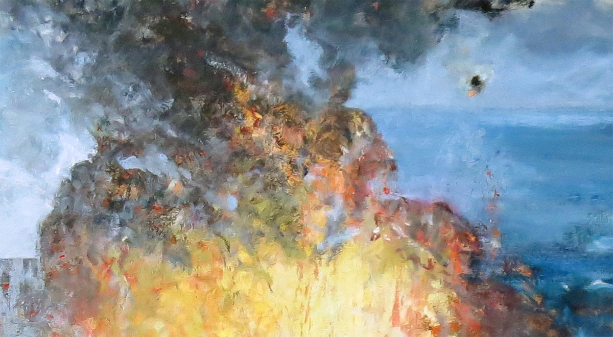
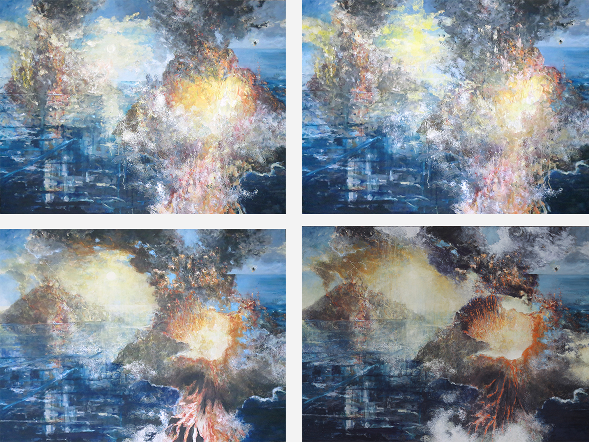
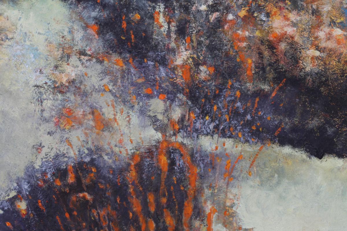
details showing eruption and lava of the volcano seen from above.
The last image shows the far away volcano.
Click on the last image to see extracts of the movie 'Stromboli, terra di Dio' (Roberto Rossellini - Ingrid Bergman, 1949).

Utrecht, February 8, 2022.